00:18:57
, Vilnius
Up Next
Up Next
Scroll Down
Up Next
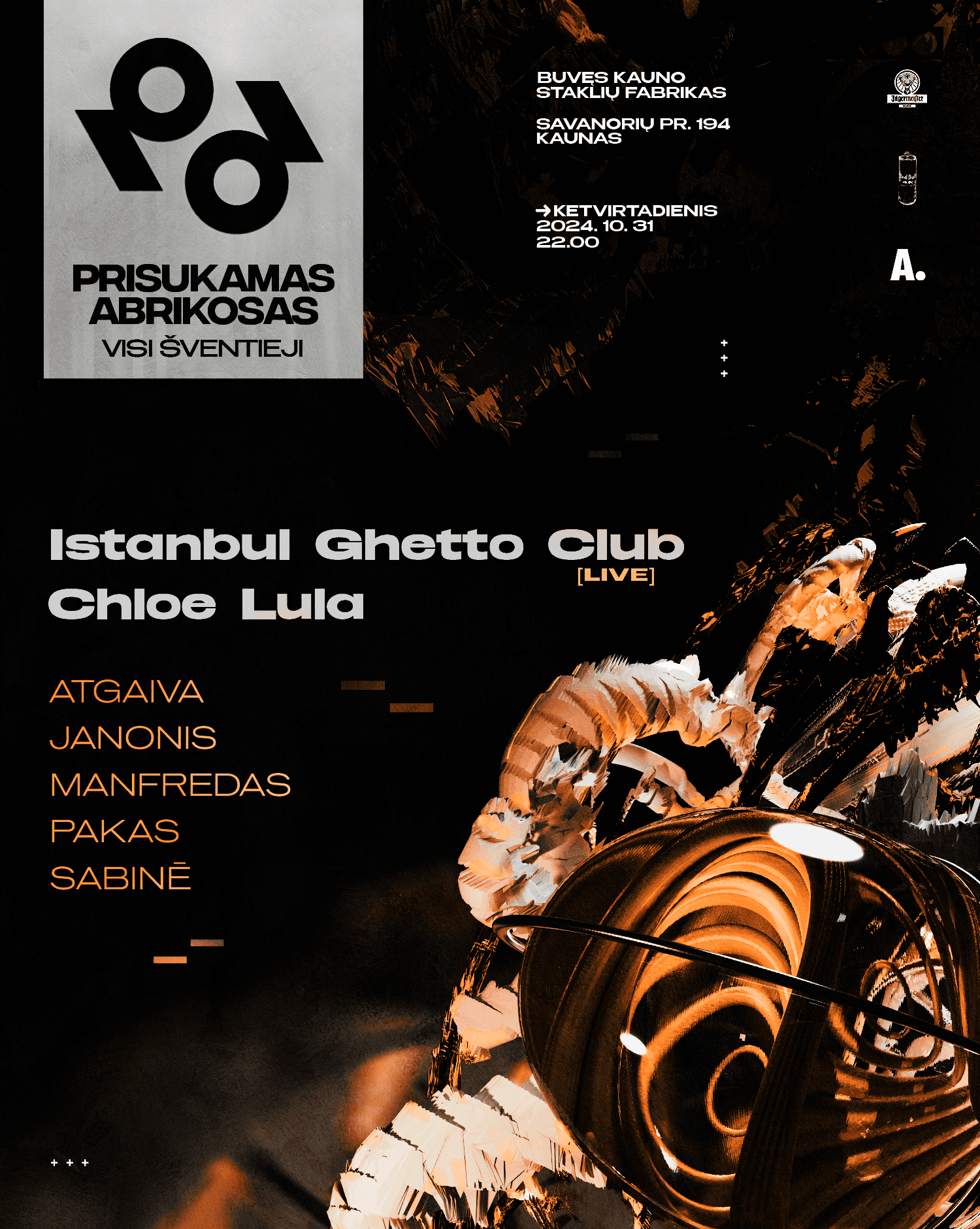
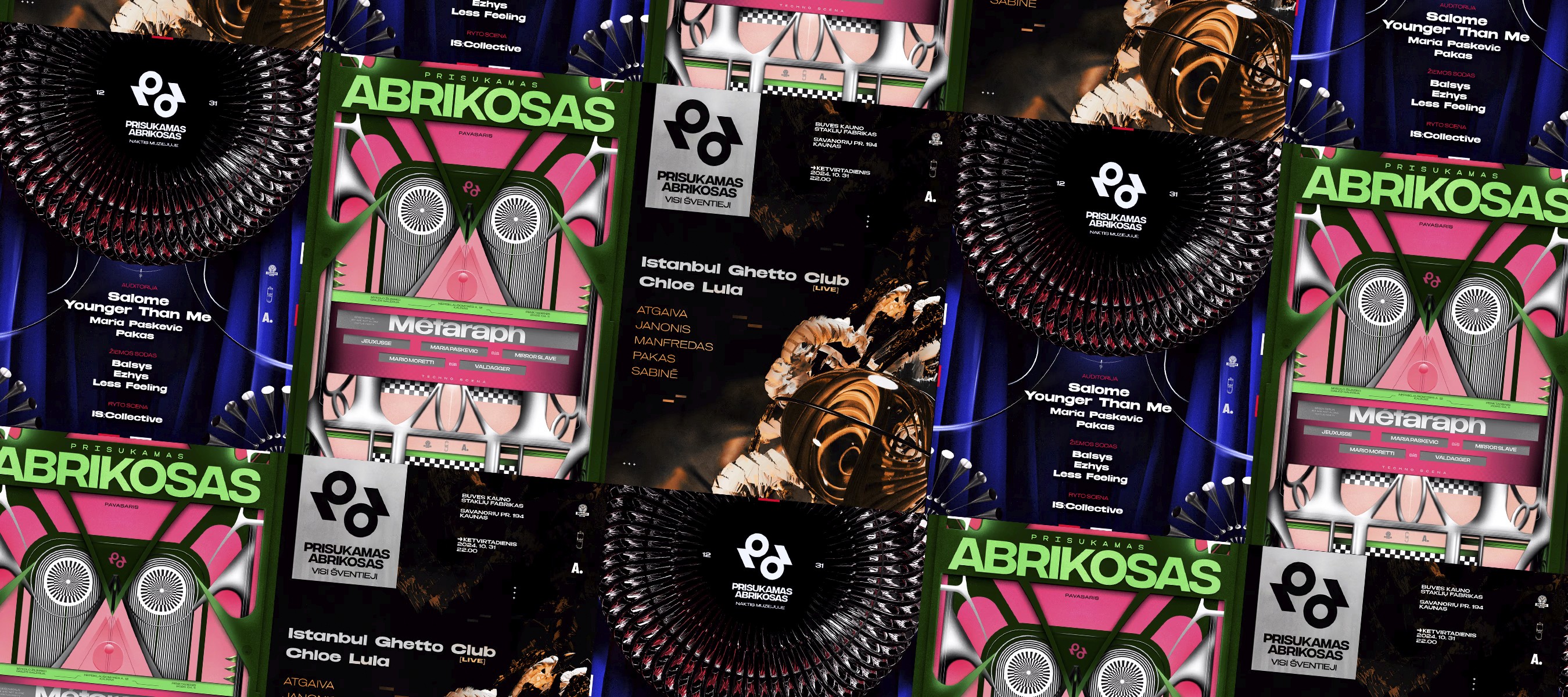
Prisukamas Abrikosas
2025
Brand Identity
Graphic Design
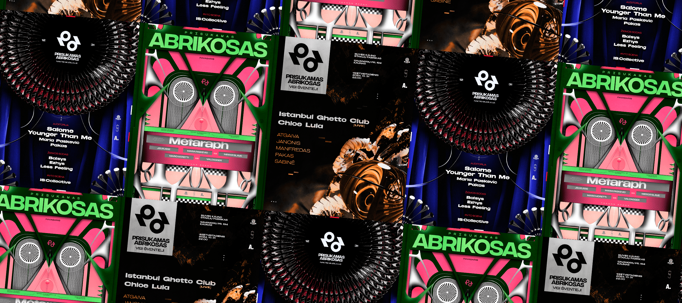
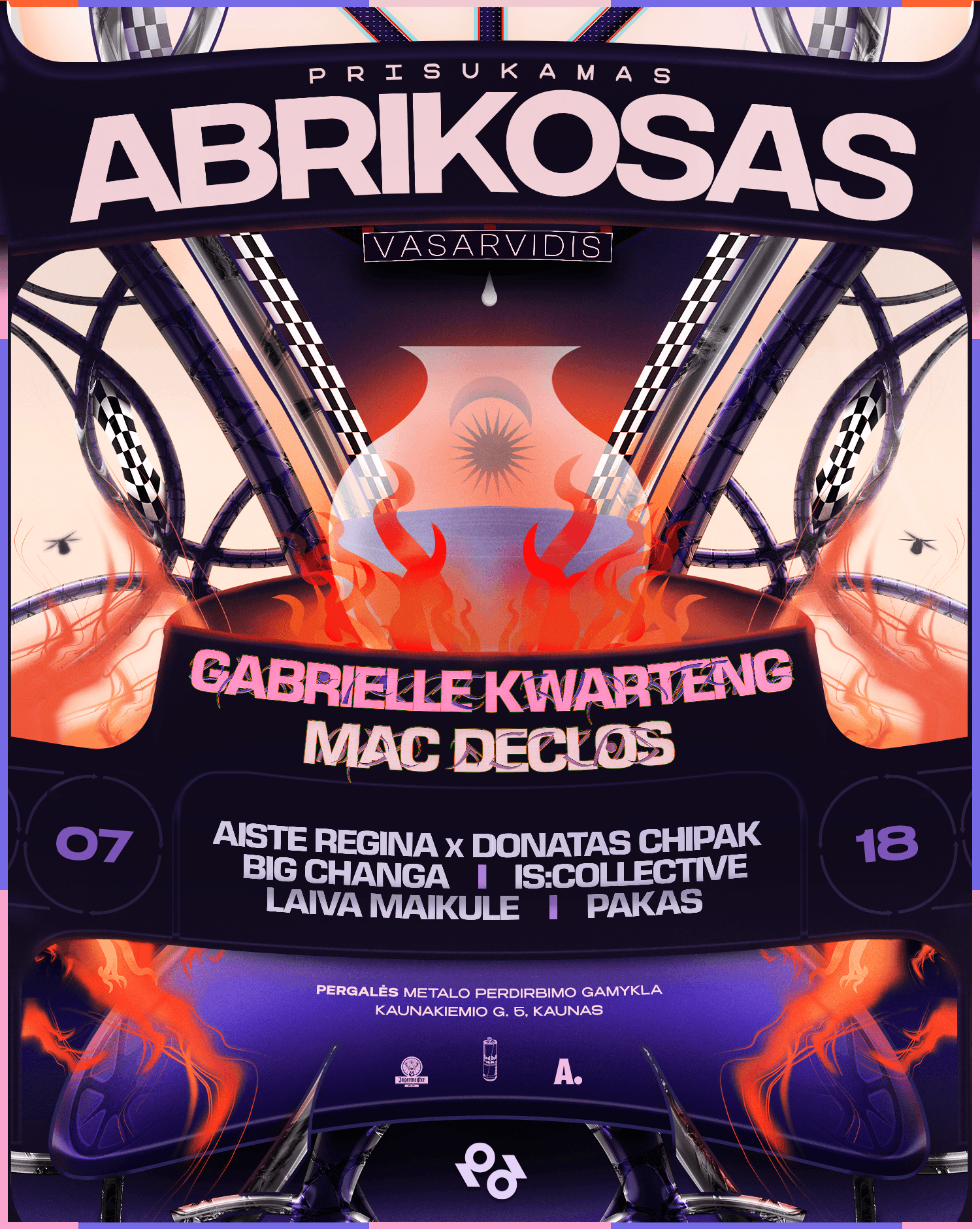
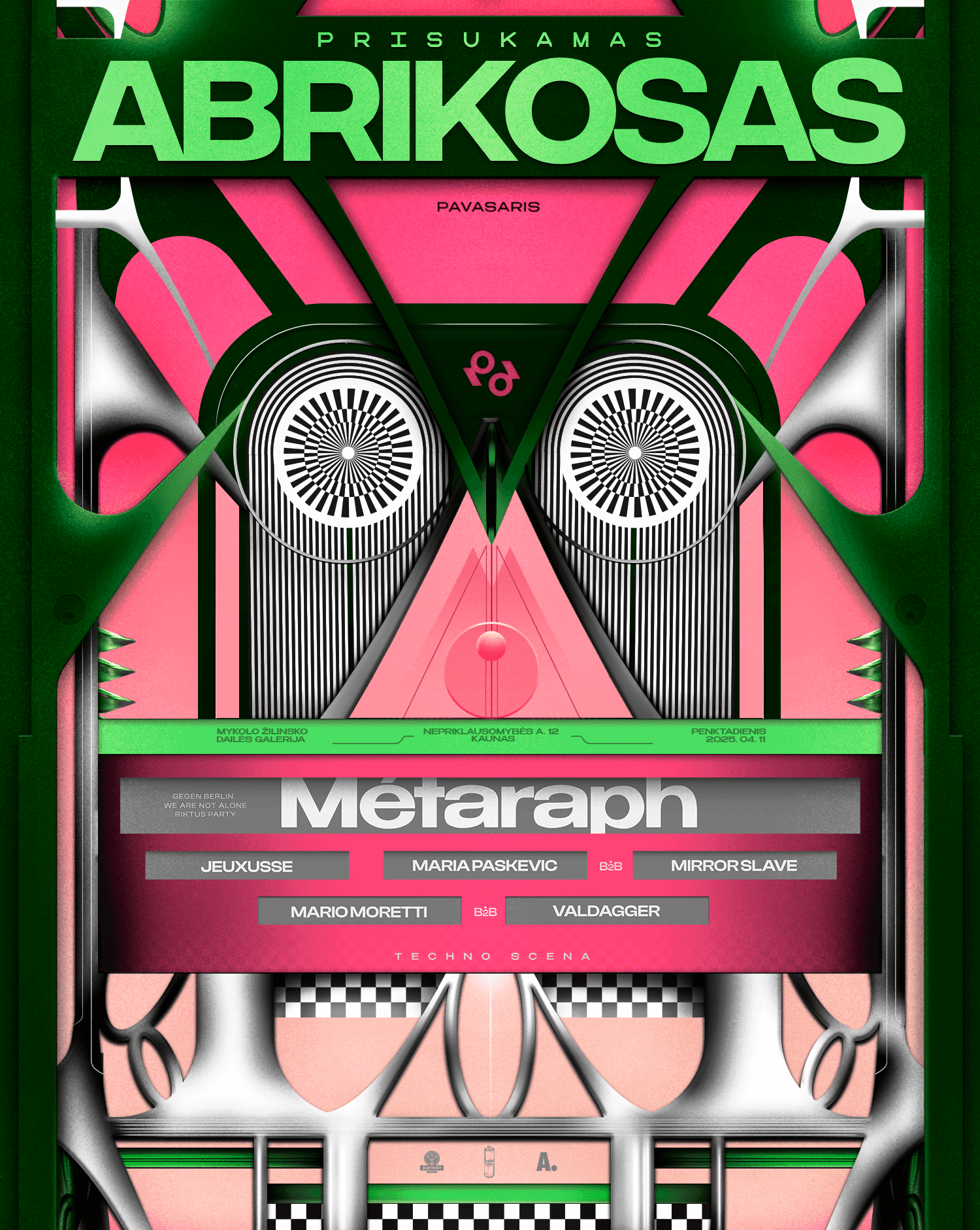
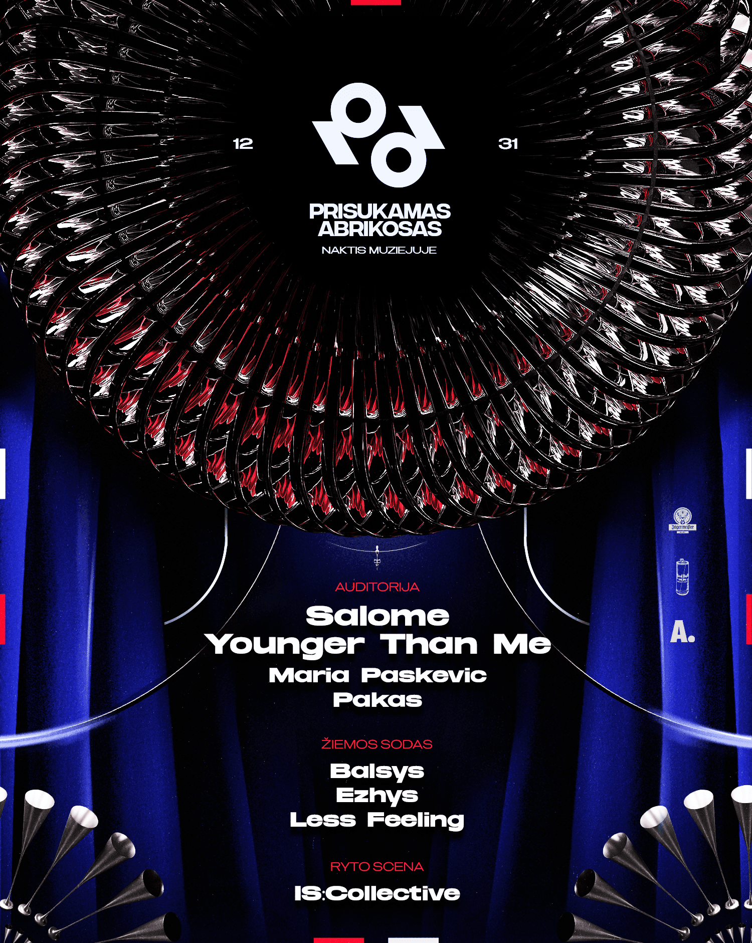
For Prisukamas Abrikosas S2024/2025, I
developed a visual identity that evolves
with the seasons— summer, spring, winter,
and autumn—each event reflecting a
distinct atmosphere.
With a new logo setting the foundation, the
design direction leaned into bold, surreal
compositions that merge industrial textures
with abstract forms. Each piece was crafted
to amplify the festival’s underground
energy, balancing sharp geometric
structures with organic movement.
The visuals weren’t just static—they were
built to interact, react, and evolve with the
music, creating a fully immersive
experience.
From the vibrant tension of spring to the
darker, more introspective mood of autumn,
the artwork carried a cohesive aesthetic
while allowing space for each event’s
character to shine.
00:18:57
, Vilnius
Up Next
Up Next
Prefer Center
2025
Brand Identity
Graphic Design
For Prisukamas Abrikosas S2024/2025, I
developed a visual identity that evolves
with the seasons— summer, spring, winter,
and autumn—each event reflecting a
distinct atmosphere.
With a new logo setting the foundation, the
design direction leaned into bold, surreal
compositions that merge industrial textures
with abstract forms. Each piece was crafted
to amplify the festival’s underground
energy, balancing sharp geometric
structures with organic movement.
The visuals weren’t just static—they were
built to interact, react, and evolve with the
music, creating a fully immersive
experience.
From the vibrant tension of spring to the
darker, more introspective mood of autumn,
the artwork carried a cohesive aesthetic
while allowing space for each event’s
character to shine.
00:18:57
, Vilnius
Up Next
Up Next
Scroll Down
Up Next
Prefer Center
2025
Brand Identity
Graphic Design
For Prisukamas Abrikosas S2024/2025, I
developed a visual identity that evolves
with the seasons— summer, spring, winter,
and autumn—each event reflecting a
distinct atmosphere.
With a new logo setting the foundation, the
design direction leaned into bold, surreal
compositions that merge industrial textures
with abstract forms. Each piece was crafted
to amplify the festival’s underground
energy, balancing sharp geometric
structures with organic movement.
The visuals weren’t just static—they were
built to interact, react, and evolve with the
music, creating a fully immersive
experience.
From the vibrant tension of spring to the
darker, more introspective mood of autumn,
the artwork carried a cohesive aesthetic
while allowing space for each event’s
character to shine.